Screenshot_20170516-140727

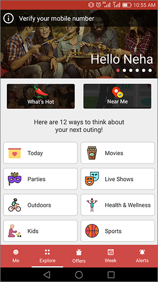
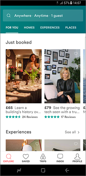
  1. App home screen uses bottom navigation for navigating throughout the app.
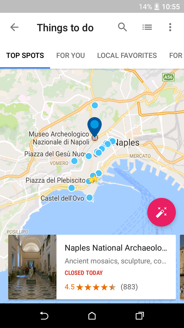
  2. It provides a search bar at the top and scrollable tabs beneath it.
  3. The content on the screen is divided into sections like Just booked, Experiences etc…
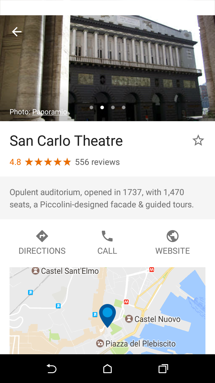
  4. The content card points out information like price, brief description, rating and number of reviews. Which are easily visible to the user at first glance.

Scrollable Tabs with Map View

17

  • Under this section user has ample amount of choices of where he can go.
  • This section reveals all the famous spots of the particular place. The more famous place is, the more choices user will have.
  • This is the map view of the famous places, user also has the option to switch to the list view by tapping second icon on the top right corner.
  • This is a good option to switch between two views.
  • By tapping on the Pink floating button user can plan his day.
  • This is the most striking feature of the application and so it is highlighted in such manner.

16

  • If a user chooses an attraction of searched place, this is how it is going to look.
  • This view is much similar to the view that we usually see in Google apps.
  • Website of the place, Direction from user’s location to the searched place, enabling user to contact the place etc. These are standard feature that google provides.

13

  • This screen has only text information and no action.
  • The challenge is to show extensive textual information on the screen.
  • In this application the textual information is made available in very organised manner.
  • Overview of the application is highlighted and text is separated from the other divisions.
  • Rest of the information is categorized  and shown under the particular category.